Liftoff coworking office visual identity
Budapest, Hungary
Photo: Norbert Juhász
2019
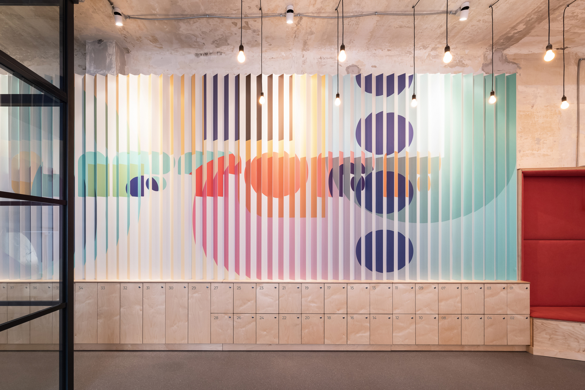
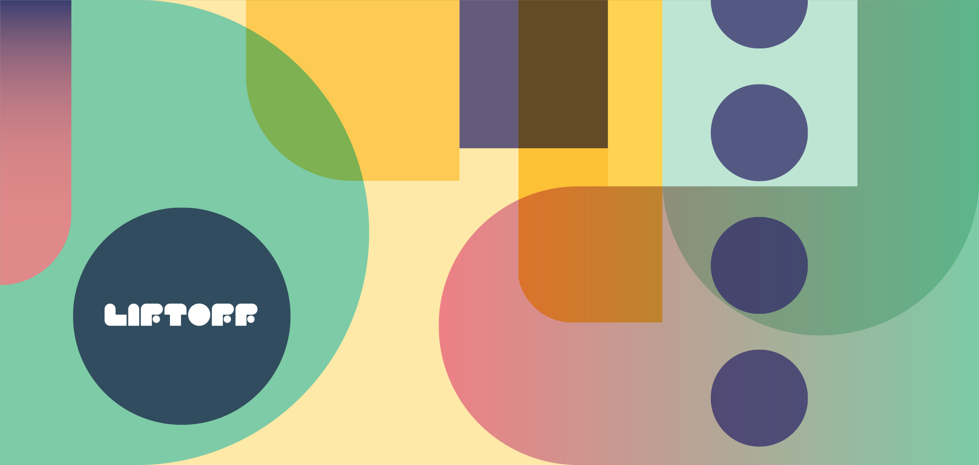
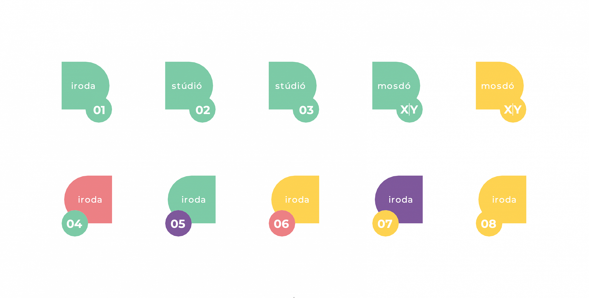
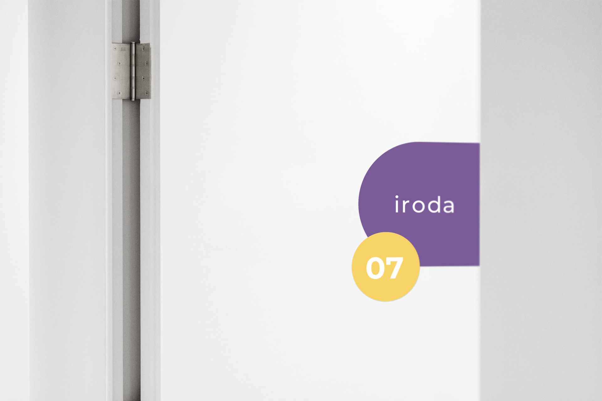
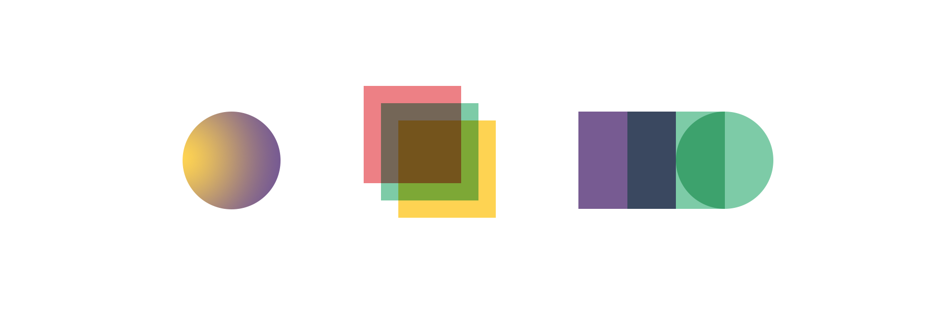
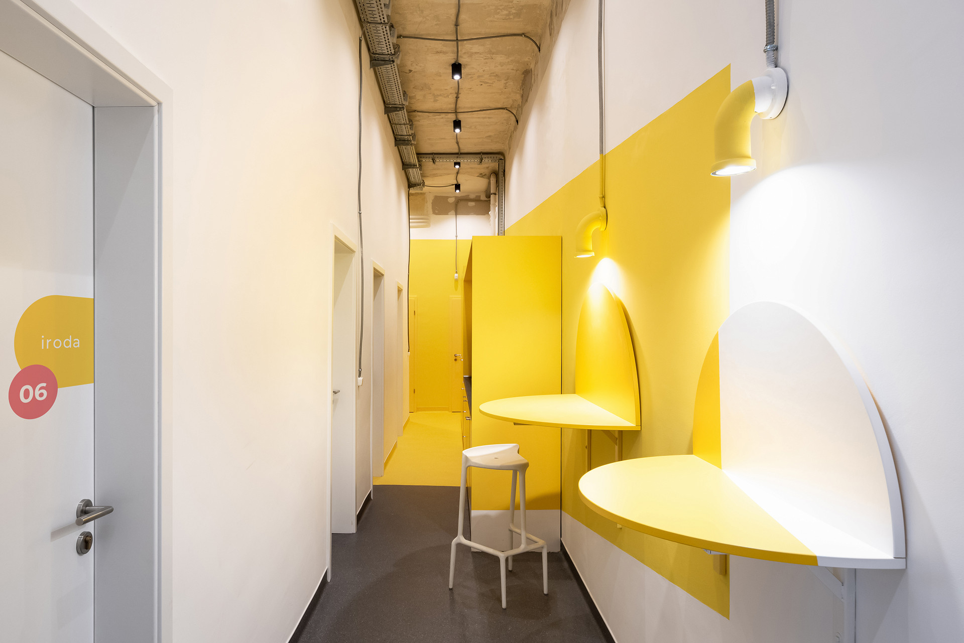
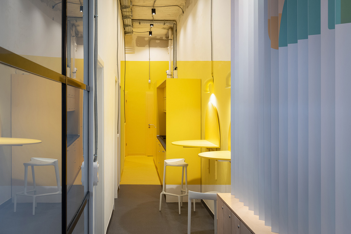
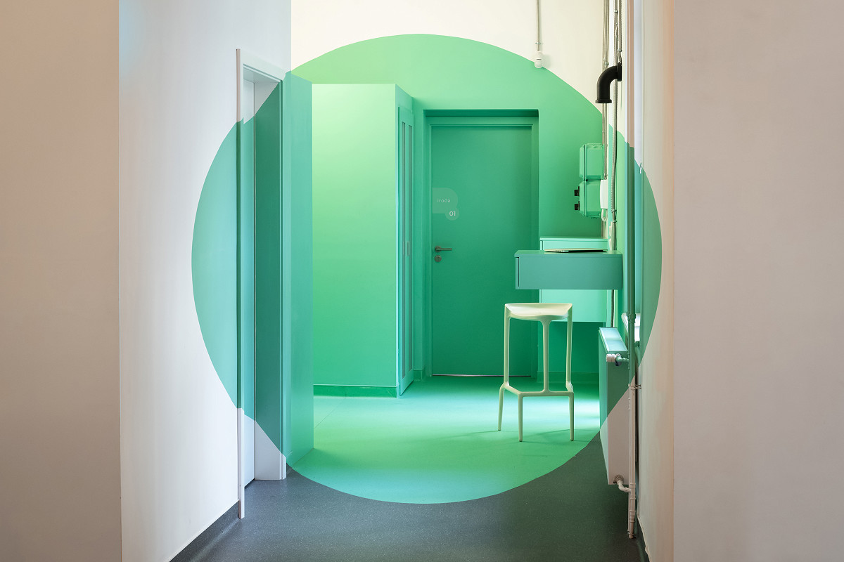
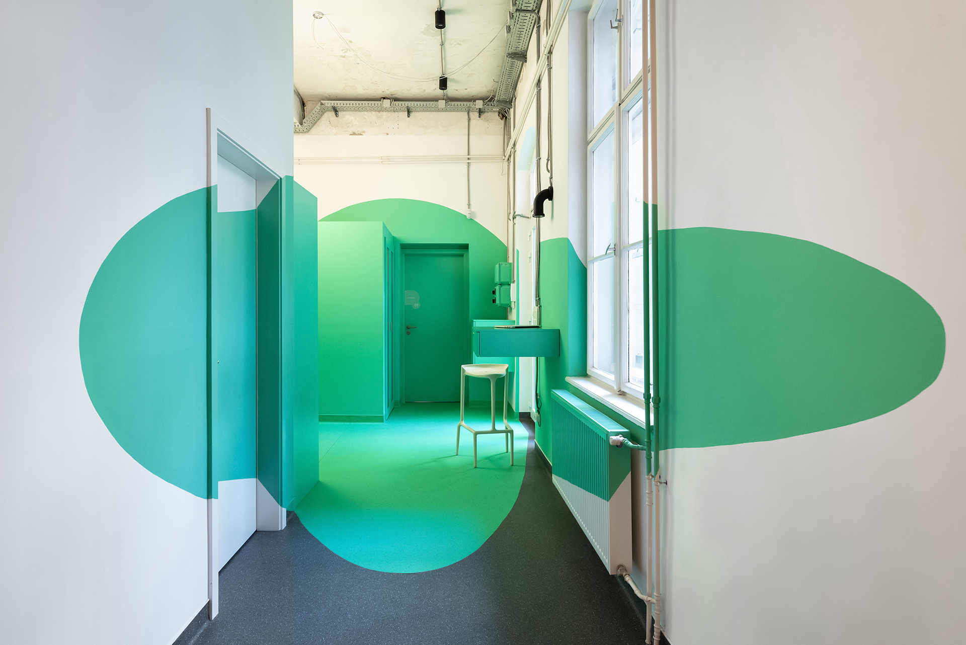
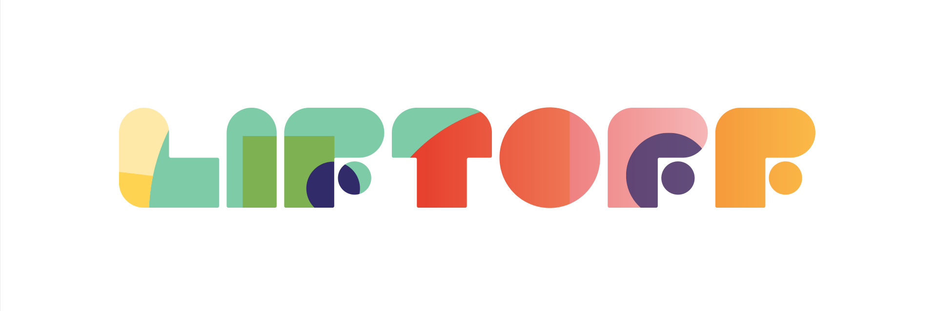
The Liftoff coworking office’s branding identity was designed parallel with the office’s interior design. In this way we could create a consistent and comprehensive visual design through the whole project. Service design with the new branding identity was also a necessity: way-finding signage, numbering for the lockers, name plates. The basic element of the branding identity is the elementary plane geometry: the circle, the rectangle and the triangle. Transforming these shapes: cutting, overlapping, intersecting and merging, results in a diverse branding identity, firstly with a geometric background topped with a geometric shaped typeface. Color usage consists of saturated colors and play with fun color, supplemented by the use of a gradient. This symbolizes the community and the opportunity of the coworking office, people of different professions working side by side or working together in the same place, helping each other or complementing each other’s works - the branding’s philosophy symbolizes the surplus of joint work. The design of the logo gives a geometric, rounded image of basic geometric shapes: circle and square, regularly, constructed from a unit of elements.